ShopDreamUp AI ArtDreamUp

Deviation Actions


![[COM] Wynali](https://images-wixmp-ed30a86b8c4ca887773594c2.wixmp.com/f/aa34ff70-c6d4-4083-8769-40eae6b0e2d1/deit320-6794133d-2fd5-4269-95f7-6ab81465a9ad.png/v1/crop/w_184,h_184,x_0,y_31,scl_0.2083805209513,q_70,strp/_com__wynali_by_planktonheretic_deit320-92s-2x.jpg?token=eyJ0eXAiOiJKV1QiLCJhbGciOiJIUzI1NiJ9.eyJzdWIiOiJ1cm46YXBwOjdlMGQxODg5ODIyNjQzNzNhNWYwZDQxNWVhMGQyNmUwIiwiaXNzIjoidXJuOmFwcDo3ZTBkMTg4OTgyMjY0MzczYTVmMGQ0MTVlYTBkMjZlMCIsIm9iaiI6W1t7ImhlaWdodCI6Ijw9MTQ4NSIsInBhdGgiOiJcL2ZcL2FhMzRmZjcwLWM2ZDQtNDA4My04NzY5LTQwZWFlNmIwZTJkMVwvZGVpdDMyMC02Nzk0MTMzZC0yZmQ1LTQyNjktOTVmNy02YWI4MTQ2NWE5YWQucG5nIiwid2lkdGgiOiI8PTg4MyJ9XV0sImF1ZCI6WyJ1cm46c2VydmljZTppbWFnZS5vcGVyYXRpb25zIl19.EUeEGSpbcaA0xVZLJvCcnNpXA6z1cy-vQvbBb2pdwUU)
![[COM] Wynali](https://images-wixmp-ed30a86b8c4ca887773594c2.wixmp.com/f/aa34ff70-c6d4-4083-8769-40eae6b0e2d1/deit320-6794133d-2fd5-4269-95f7-6ab81465a9ad.png/v1/crop/w_92,h_92,x_0,y_16,scl_0.10419026047565,q_70,strp/_com__wynali_by_planktonheretic_deit320-92s.jpg?token=eyJ0eXAiOiJKV1QiLCJhbGciOiJIUzI1NiJ9.eyJzdWIiOiJ1cm46YXBwOjdlMGQxODg5ODIyNjQzNzNhNWYwZDQxNWVhMGQyNmUwIiwiaXNzIjoidXJuOmFwcDo3ZTBkMTg4OTgyMjY0MzczYTVmMGQ0MTVlYTBkMjZlMCIsIm9iaiI6W1t7ImhlaWdodCI6Ijw9MTQ4NSIsInBhdGgiOiJcL2ZcL2FhMzRmZjcwLWM2ZDQtNDA4My04NzY5LTQwZWFlNmIwZTJkMVwvZGVpdDMyMC02Nzk0MTMzZC0yZmQ1LTQyNjktOTVmNy02YWI4MTQ2NWE5YWQucG5nIiwid2lkdGgiOiI8PTg4MyJ9XV0sImF1ZCI6WyJ1cm46c2VydmljZTppbWFnZS5vcGVyYXRpb25zIl19.EUeEGSpbcaA0xVZLJvCcnNpXA6z1cy-vQvbBb2pdwUU)


![[COM] Atia, Might of Maldraxxus!](https://images-wixmp-ed30a86b8c4ca887773594c2.wixmp.com/f/aa34ff70-c6d4-4083-8769-40eae6b0e2d1/deffbu6-c51a0dce-0ac5-4daa-adb6-e11a79413b2b.png/v1/crop/w_184,h_184,x_0,y_40,scl_0.20331491712707/_com__atia__might_of_maldraxxus__by_planktonheretic_deffbu6-92s-2x.png?token=eyJ0eXAiOiJKV1QiLCJhbGciOiJIUzI1NiJ9.eyJzdWIiOiJ1cm46YXBwOjdlMGQxODg5ODIyNjQzNzNhNWYwZDQxNWVhMGQyNmUwIiwiaXNzIjoidXJuOmFwcDo3ZTBkMTg4OTgyMjY0MzczYTVmMGQ0MTVlYTBkMjZlMCIsIm9iaiI6W1t7ImhlaWdodCI6Ijw9MTY4NSIsInBhdGgiOiJcL2ZcL2FhMzRmZjcwLWM2ZDQtNDA4My04NzY5LTQwZWFlNmIwZTJkMVwvZGVmZmJ1Ni1jNTFhMGRjZS0wYWM1LTRkYWEtYWRiNi1lMTFhNzk0MTNiMmIucG5nIiwid2lkdGgiOiI8PTkwNSJ9XV0sImF1ZCI6WyJ1cm46c2VydmljZTppbWFnZS5vcGVyYXRpb25zIl19.lx7juYlD7XsifVhuYO_BCe0pDxcKJFxn4qu6jTwkRdY)
![[COM] Atia, Might of Maldraxxus!](https://images-wixmp-ed30a86b8c4ca887773594c2.wixmp.com/f/aa34ff70-c6d4-4083-8769-40eae6b0e2d1/deffbu6-c51a0dce-0ac5-4daa-adb6-e11a79413b2b.png/v1/crop/w_92,h_92,x_0,y_20,scl_0.10165745856354/_com__atia__might_of_maldraxxus__by_planktonheretic_deffbu6-92s.png?token=eyJ0eXAiOiJKV1QiLCJhbGciOiJIUzI1NiJ9.eyJzdWIiOiJ1cm46YXBwOjdlMGQxODg5ODIyNjQzNzNhNWYwZDQxNWVhMGQyNmUwIiwiaXNzIjoidXJuOmFwcDo3ZTBkMTg4OTgyMjY0MzczYTVmMGQ0MTVlYTBkMjZlMCIsIm9iaiI6W1t7ImhlaWdodCI6Ijw9MTY4NSIsInBhdGgiOiJcL2ZcL2FhMzRmZjcwLWM2ZDQtNDA4My04NzY5LTQwZWFlNmIwZTJkMVwvZGVmZmJ1Ni1jNTFhMGRjZS0wYWM1LTRkYWEtYWRiNi1lMTFhNzk0MTNiMmIucG5nIiwid2lkdGgiOiI8PTkwNSJ9XV0sImF1ZCI6WyJ1cm46c2VydmljZTppbWFnZS5vcGVyYXRpb25zIl19.lx7juYlD7XsifVhuYO_BCe0pDxcKJFxn4qu6jTwkRdY)


![[commission] IA-6](https://images-wixmp-ed30a86b8c4ca887773594c2.wixmp.com/f/2ff18e16-2240-423a-a66b-208cfcbec109/d7w9ust-4038cf22-8784-4e69-bc37-66c447a716ea.jpg/v1/crop/w_184,h_184,x_0,y_19,scl_0.21698113207547,q_70,strp/_commission__ia_6_by_sirmeo_d7w9ust-92s-2x.jpg?token=eyJ0eXAiOiJKV1QiLCJhbGciOiJIUzI1NiJ9.eyJzdWIiOiJ1cm46YXBwOjdlMGQxODg5ODIyNjQzNzNhNWYwZDQxNWVhMGQyNmUwIiwiaXNzIjoidXJuOmFwcDo3ZTBkMTg4OTgyMjY0MzczYTVmMGQ0MTVlYTBkMjZlMCIsIm9iaiI6W1t7ImhlaWdodCI6Ijw9MTIwMCIsInBhdGgiOiJcL2ZcLzJmZjE4ZTE2LTIyNDAtNDIzYS1hNjZiLTIwOGNmY2JlYzEwOVwvZDd3OXVzdC00MDM4Y2YyMi04Nzg0LTRlNjktYmMzNy02NmM0NDdhNzE2ZWEuanBnIiwid2lkdGgiOiI8PTg0OCJ9XV0sImF1ZCI6WyJ1cm46c2VydmljZTppbWFnZS5vcGVyYXRpb25zIl19.XwMUi8xzzk6tJ3821XRWmGDyiqAk3ec1Kzs7KC82Xzk)
![[commission] IA-6](https://images-wixmp-ed30a86b8c4ca887773594c2.wixmp.com/f/2ff18e16-2240-423a-a66b-208cfcbec109/d7w9ust-4038cf22-8784-4e69-bc37-66c447a716ea.jpg/v1/crop/w_92,h_92,x_0,y_10,scl_0.10849056603774,q_70,strp/_commission__ia_6_by_sirmeo_d7w9ust-92s.jpg?token=eyJ0eXAiOiJKV1QiLCJhbGciOiJIUzI1NiJ9.eyJzdWIiOiJ1cm46YXBwOjdlMGQxODg5ODIyNjQzNzNhNWYwZDQxNWVhMGQyNmUwIiwiaXNzIjoidXJuOmFwcDo3ZTBkMTg4OTgyMjY0MzczYTVmMGQ0MTVlYTBkMjZlMCIsIm9iaiI6W1t7ImhlaWdodCI6Ijw9MTIwMCIsInBhdGgiOiJcL2ZcLzJmZjE4ZTE2LTIyNDAtNDIzYS1hNjZiLTIwOGNmY2JlYzEwOVwvZDd3OXVzdC00MDM4Y2YyMi04Nzg0LTRlNjktYmMzNy02NmM0NDdhNzE2ZWEuanBnIiwid2lkdGgiOiI8PTg0OCJ9XV0sImF1ZCI6WyJ1cm46c2VydmljZTppbWFnZS5vcGVyYXRpb25zIl19.XwMUi8xzzk6tJ3821XRWmGDyiqAk3ec1Kzs7KC82Xzk)


Description
Download for full view, and I would love to hear what you think!
Thanks for looking!
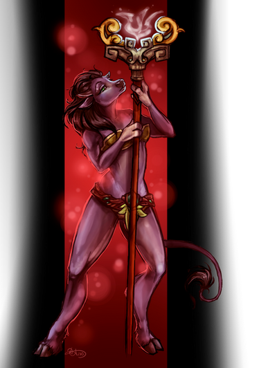
This was (another, haha) commission for the groovy Ktok on Twitter. His death knight, Pakhet.
Ktok wrote a story of how Pakhet came to be a Death Knight, and is still working on it. Its the best piece of WoW fiction I've ever read, and I've read a lot of it.
It was an absolute pleasure to do this picture, I haven't worked with a spotted tauren before so it was a bit of a technical challenge to shade it without messing up the spot pattern.
Photoshop crashed without a .tmp file right when I finished the lineart and of course I hadn't saved yet. Rrg.
8 hours
Photoshop CS2
6x4 Wacom Bamboo Tablet
Pakhet played by @Ktok of Portent Alliance
Art is by me")
Thanks for looking!
This was (another, haha) commission for the groovy Ktok on Twitter. His death knight, Pakhet.
Ktok wrote a story of how Pakhet came to be a Death Knight, and is still working on it. Its the best piece of WoW fiction I've ever read, and I've read a lot of it.
It was an absolute pleasure to do this picture, I haven't worked with a spotted tauren before so it was a bit of a technical challenge to shade it without messing up the spot pattern.
Photoshop crashed without a .tmp file right when I finished the lineart and of course I hadn't saved yet. Rrg.
8 hours
Photoshop CS2
6x4 Wacom Bamboo Tablet
Pakhet played by @Ktok of Portent Alliance
Art is by me
Image size
1203x1579px 699.54 KB
© 2010 - 2024 baenling
Comments45
Join the community to add your comment. Already a deviant? Log In
You've got a great start on this stuff, Karnokoto! Your posing is dynamic and your character feels like she's really setting her mass on the ground, which is fantastic. I also like the varied line weights you use in the hair. There are just a couple of suggestions I'd like to make.
You've clearly got a good start on color theory, which is helpful. You've got a nice complementary color scheme going here with the desaturated orange and the blue. I do notice, though, that you've chosen to use a pure white light...when creating a shadow, you just use a darker and/or more desaturated version of the same color and white in your highlights. While this has its time and place, you may consider adding some dynamism by using a colored light in future pictures, making its complementary color the shadow. In this case, you had two basic choices that wouldn't complicate your current color scheme: orange light with blue-tinted shadows, or blue light with orange-tinted. Now, some people will argue that the warmer color (orange) should always be the highlight and the cooler one the shadow, but in truth, it can be done well both ways. (It is, however, probably harder to make a picture successful with a cool light source.) Here's a quick, bad mock-up of the two suggestions on this image.
On that note, had you gone with orange light, you may have considered going even further with an orange sky, with appropriate reflections in the background. I know Icecrown is all cold and icy and you're portraying the same of the death knight...but you still have options. For example, a cool-color background can let the DK blend right into it, a frozen feature in a frozen landscape. If the background were a warm color, you could still portray a frozen landscape, but have a cool-colored DK look frozen even for an icy wasteland. ...It just depends on the tone you're going for. <img src="e.deviantart.net/emoticons/s/s…" width="15" height="15" alt="
Alright. Leaving behind color theory, your light source is directly above her, right? Unusual, and nicely done.
Finally, texture. Metal is, pardon the phrasology, a bitch to draw. Even blackened metal is pretty high contrast unless it's painted black. Here's a quick paint-over, about fifteen seconds of work, with nothing but a white brush on 100% opacity: [X] For a more blackened effect, I've personally experimented with starting with an dark, off-grey off appropriate color and then using color dodge (and the same color on my brush) to slooowly brighten up the highlights into something higher contrast. It's a painfully slow process, though eventually it looks like this. either way, the moral is that metal is a unique substance of lots of reflection and contrast whether it's glossy or not, and definitely worth having some fun with. You may also try brushing in some colors from the environment into the reflections.
![[X]](https://www.deviantart.com/users/outgoing?http://i156.photobucket.com/albums/t28/Silkspinner/Pakhetcontrast.jpg)
Random, final suggestion: I've discovered that it's useful to have little, uneven bits of snow coming up over bits of a character's feet. What she's standing on right now must be REALLY hard-packed and not fresh.
I think I've talked way more than long enough, but I hope you can take something useful from somewhere in the wall of text. This looks great, and I look forward to seeing what you'll be doing in the future!